R for Data Science

AITI Talk

Haziq Jamil, PhD

Assistant Professor in Statistics, Universiti Brunei Darussalam
Visiting Fellow, London School of Economics and Political Science

https://haziqj.ml/aiti-talk/

May 21, 2025

Who we are

Instructions and material available at https://haziqj.ml/ aiti-talk/

Plan for today

Time Activity
0830 – 0900 Introduction & Getting Started with R
0900 – 1000 Lecture 1: Basic Statistics
1000 – 1030 Break
1030 – 1130 Lecture 2: Advanced R stuff
1130 – 1200 Networking

slido.com code: 3244786

Let’s start

Introduction

Datasaurus supports you!

  • Automate End-to-End Survey Processing
    Write one script that pulls raw survey responses, cleans and validates fields and outputs ready-to-analyse datasets.

  • Standardise Analysis & Quality Checks
    Embed your business rules into reusable code so every round adheres to the same quality standards.

  • Generate Dynamic Reports in Seconds
    Turn your cleaned data into up-to-date charts, tables and written summaries automatically.

  • Quickly Prototype “What-If” Scenarios
    Simulate alternative weighting schemes, forecast adoption trends or run sensitivity analyses on key ICT indicators to guide policy adjustments.

The main game


Why choose R?

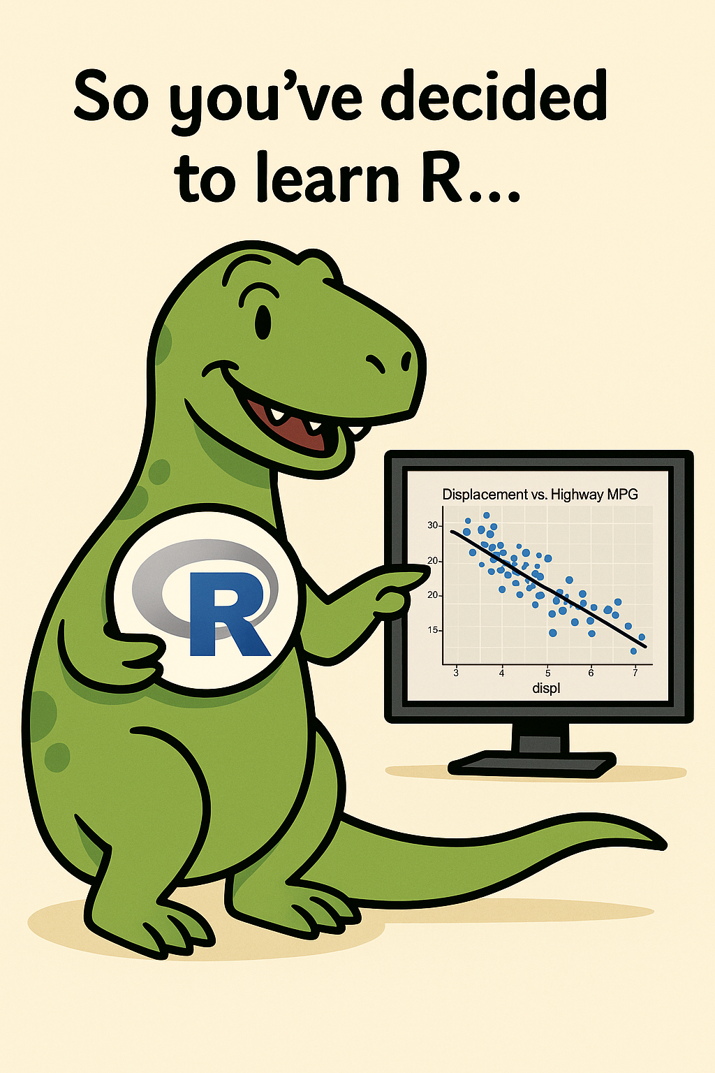
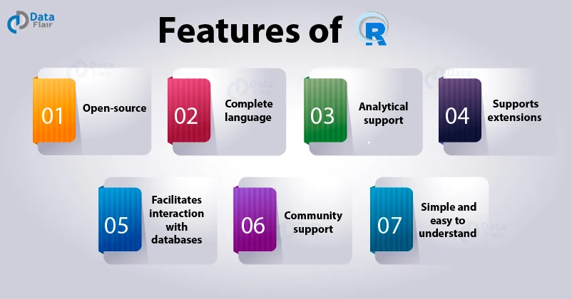
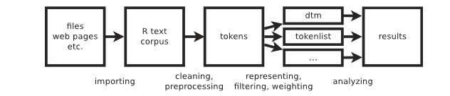
R is an interpreted programming language for statistical computing and data visualisation. It has been adopted in many fields, especially quantitive fields like data science.
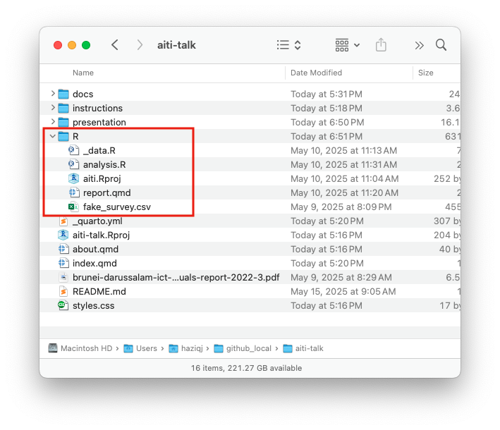
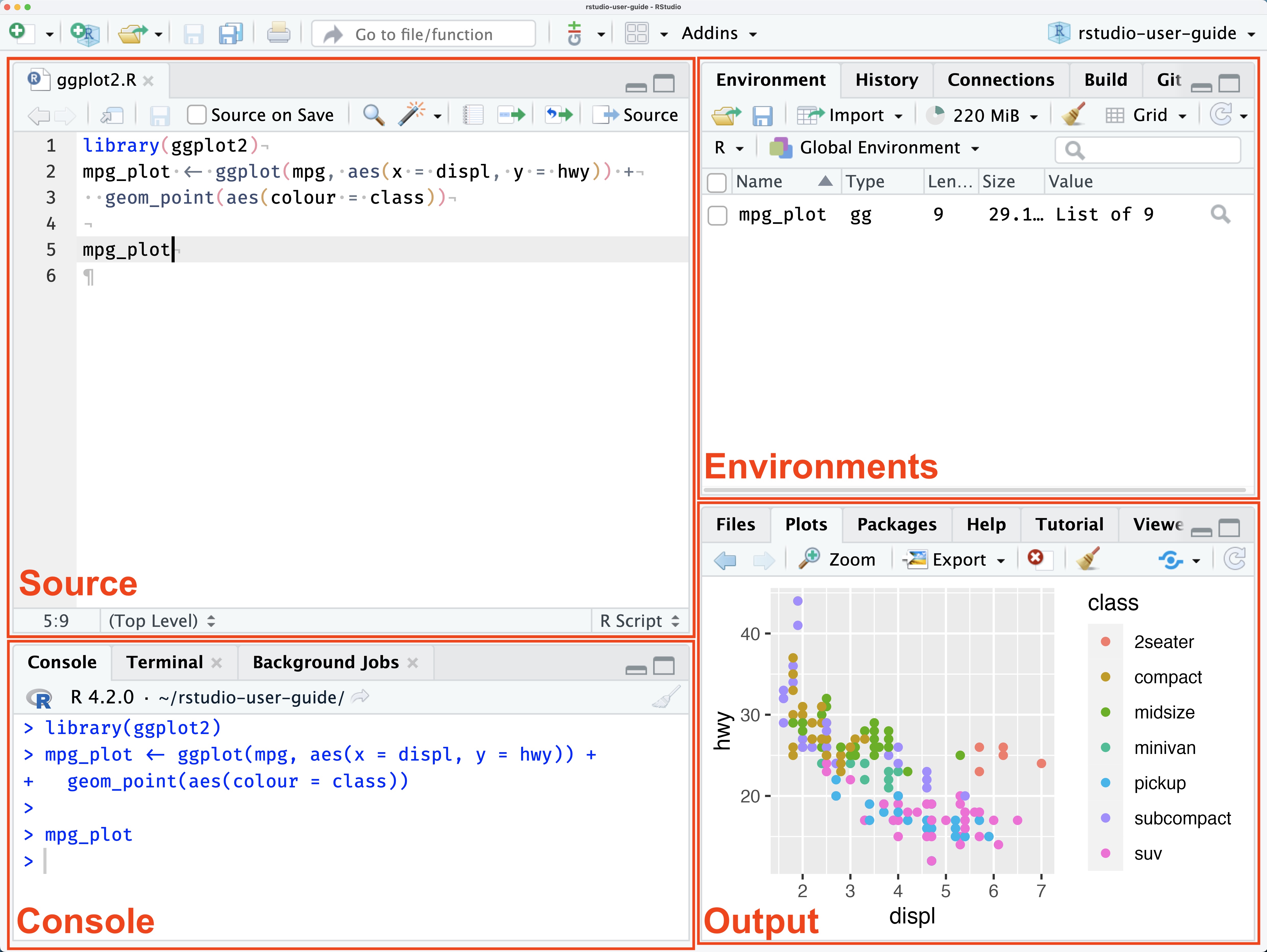
R and RStudio

  • You can run R in the terminal, the R GUI, or other apps like RStudio.
  • RStudio is an IDE (integrated development environment) for R.
  • Alternatives include VSCode, Emacs, and <insert favourite IDE>.
my_string <- "Hello, World!"
print(my_string)
[1] "Hello, World!"
# Create a vector, manipulate it
x <- c(1, 2, 3, 4, 5)
sum(x) / length(x)
[1] 3
for (i in x) print(i)
[1] 1
[1] 2
[1] 3
[1] 4
[1] 5

Lay of the land

Project folder

  1. Download material from https://github.com/haziqj/aiti-talk
  2. Choose a location to save the project
  3. Go to the R/ folder, and open the aiti.RProj file
  4. This will open a new RStudio project

Project folder

R needs to know where is your project’s “home” directory. By clicking on the RProj file, RStudio will set the working directory to the project folder.

Lay of the land

RStudio

Preamble

library(tidyverse)  # data wrangling tools
library(tinyplot)   # for quick plotting
library(tidytext)   # bigrams
library(tm)         # text mining
library(wordcloud)  # word clouds
library(gtsummary)  # pretty summary tables
library(bruneimap)  # for mapping

theme_set(theme_bw())  # ggplot2
tinytheme("clean2")    # tinyplot

Installing packages

In RStudio, if a package is not installed, a yellow ribbon will appear prompting you to install it. You can also manually install packages by running:

install.packages("<package name>")  # only need to install once
library("<package name>")           # but load the package every time!

Or browse the ‘Packages’ pane in RStudio.

Importing data

dat <- read_csv("fake_survey.csv")
glimpse(dat)
Rows: 2,000
Columns: 13
$ id         <dbl> 1, 2, 3, 4, 5, 6, 7, 8, 9, 10, 11, 12, 13, 14, 15, 16, 17, …
$ kampong    <chr> "Kg. Lorong Tiga Selatan", "Kg. Anggerek Desa", "Kg. Bebati…
$ mukim      <chr> "Mukim Seria", "Mukim Berakas A", "Mukim Pangkalan Batu", "…
$ district   <chr> "Belait", "Brunei-Muara", "Brunei-Muara", "Belait", "Brunei…
$ gender     <chr> "Female", "Male", "Female", "Male", "Male", "Female", "Male…
$ age        <dbl> 47, 38, 42, 47, 50, 33, 54, 38, 33, 38, 18, 39, 33, 25, 53,…
$ education  <chr> "O Level", "O Level", "O Level", "Higher National Diploma",…
$ q_fbspeed  <dbl> 54, 58, 711, 56, 187, 58, 55, 88, 888, 146, 20, 37, 53, 192…
$ q_fbqual   <chr> "Fair", "Very Good", "Poor", "Very Good", "Good", "Fair", "…
$ q_mbqual   <chr> "Poor", "Good", "Good", "Good", "Good", "Good", "Good", "Fa…
$ q_fbexpend <dbl> 782.00000, 78.29368, 745.31846, 78.29368, 640.10037, 622.72…
$ q_fbusage  <dbl> 620, 260, 750, 320, 290, 410, 120, 450, 310, 120, 390, 190,…
$ q_limiting <chr> "I'll almost never download software that costs hundreds of…

Demographic vs study questions

Usually, a survey contains two types of question: 1) Demographic, and 2) study questions.

Data types

graph TD
    A[**Data Type**]
    
    A --> B["**Logical**<br><br>e.g. TRUE, FALSE"]
    A --> C[**Numeric**]
    A --> D["**Complex**<br><br>e.g. 1+2i, 3+4i"]
    A --> E["**Character**<br><br>e.g. 'cat', 'blue'"]
    
    C --> CA["**Integer**<br><br>e.g. 1L, 314L"]
    C --> CB["**Double**<br><br>e.g. 1.23, 3.141"]
    
    E --> EA["**Factor**<br><br>e.g. 'MOE', 'MTIC', 'MOH'"]
    E --> EB["**Ordered**<br><br>e.g. 'Disagree', 'Neutral',<br>'Agree'"]
    
    %% Assign nodes to classes
    class EA pink
    class EB pink

    %% Define styles for the classes
    classDef pink fill:#f9c,color:#fff,stroke:#333,stroke-width:1px

Know your data types

We must know the data types of our variables to perform the correct operations on them. For example, if we want to calculate the mean of a variable, it must be numeric. If it is a factor/ordered, we need to convert it to numeric first.

Transforming data

dat <-
  dat |>
  mutate(
    gender = factor(gender, levels = c("Male", "Female")),
    # Convert education to factors
    education = factor(education, levels = c(
      "Primary School", "Lower Secondary", "O Level", "A Level", 
      "National Certificate", "Diploma", "National Diploma", 
      "Higher National Diploma", "Bachelor Degree", "Master Degree", "PhD"
    )),
    # Convert Likert scale to ordered factors
    across(c(q_mbqual, q_fbqual), function(x) ordered(x, levels = c(
      "Very Poor", "Poor", "Fair", "Good", "Very Good", "Excellent"
    )))
  )

glimpse(dat)

Transforming data

Rows: 2,000
Columns: 13
$ id         <dbl> 1, 2, 3, 4, 5, 6, 7, 8, 9, 10, 11, 12, 13, 14, 15, 16, 17, …
$ kampong    <chr> "Kg. Lorong Tiga Selatan", "Kg. Anggerek Desa", "Kg. Bebati…
$ mukim      <chr> "Mukim Seria", "Mukim Berakas A", "Mukim Pangkalan Batu", "…
$ district   <chr> "Belait", "Brunei-Muara", "Brunei-Muara", "Belait", "Brunei…
$ gender     <fct> Female, Male, Female, Male, Male, Female, Male, Male, Male,…
$ age        <dbl> 47, 38, 42, 47, 50, 33, 54, 38, 33, 38, 18, 39, 33, 25, 53,…
$ education  <fct> O Level, O Level, O Level, Higher National Diploma, Bachelo…
$ q_fbspeed  <dbl> 54, 58, 711, 56, 187, 58, 55, 88, 888, 146, 20, 37, 53, 192…
$ q_fbqual   <ord> Fair, Very Good, Poor, Very Good, Good, Fair, Very Good, Ve…
$ q_mbqual   <ord> Poor, Good, Good, Good, Good, Good, Good, Fair, Very Poor, …
$ q_fbexpend <dbl> 782.00000, 78.29368, 745.31846, 78.29368, 640.10037, 622.72…
$ q_fbusage  <dbl> 620, 260, 750, 320, 290, 410, 120, 450, 310, 120, 390, 190,…
$ q_limiting <chr> "I'll almost never download software that costs hundreds of…
head(as.numeric(dat$q_mbqual), 15)
 [1] 2 4 4 4 4 4 4 3 1 5 4 5 6 4 4
head(as.numeric(dat$kampong), 15)
 [1] NA NA NA NA NA NA NA NA NA NA NA NA NA NA NA

Tidy data

Tidy data (cont.)

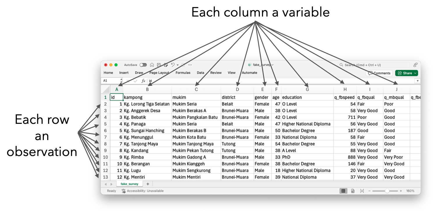
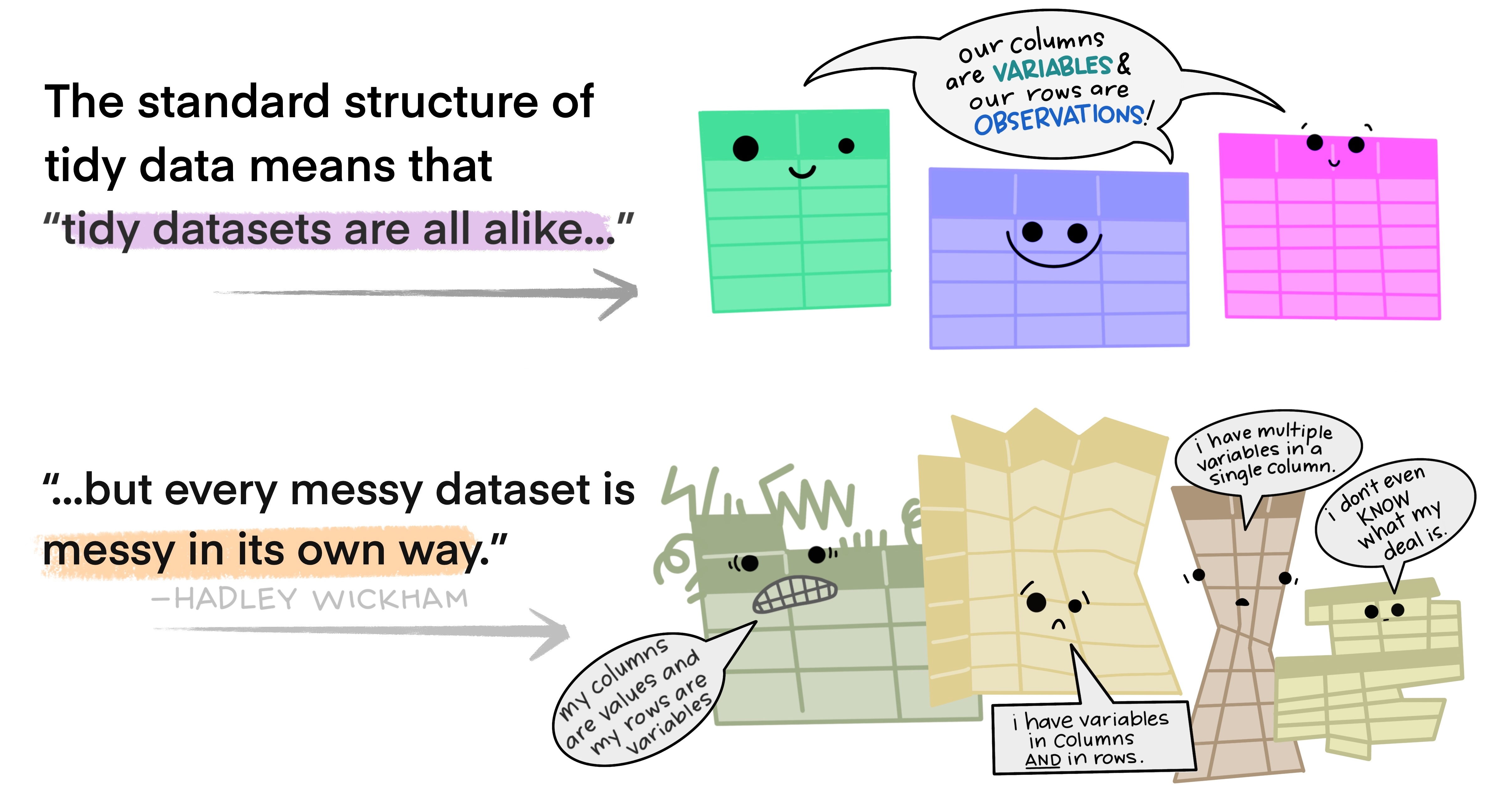
All happy families are alike; each unhappy family is unhappy in its own way. —Leo Tolstoy

Mindset shift & expectations

  • Emphasis on writing reproducible R code

  • Appreciate that there’s a leaRning curve

  • Goal of the talk is to show what R is capable of

Basics

Variability

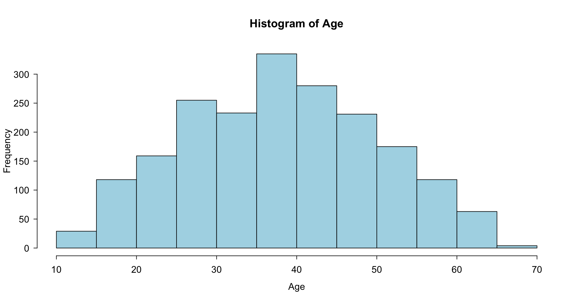
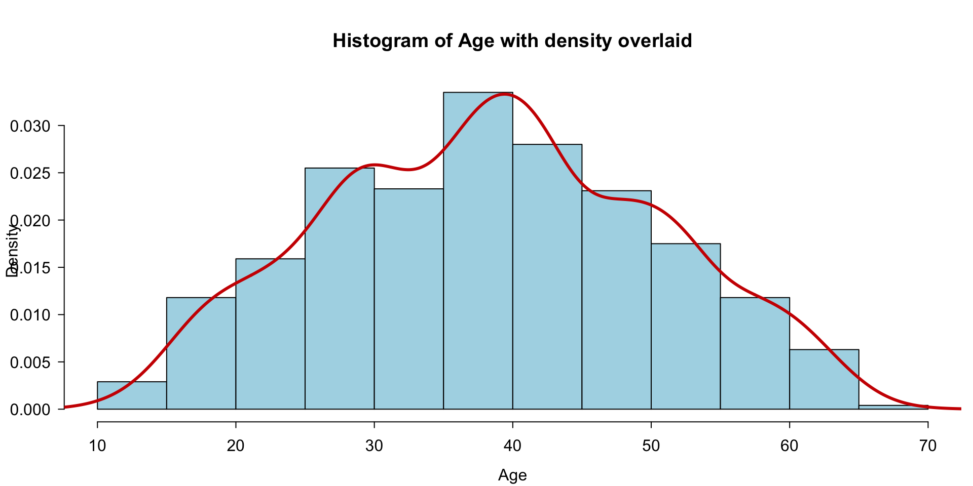
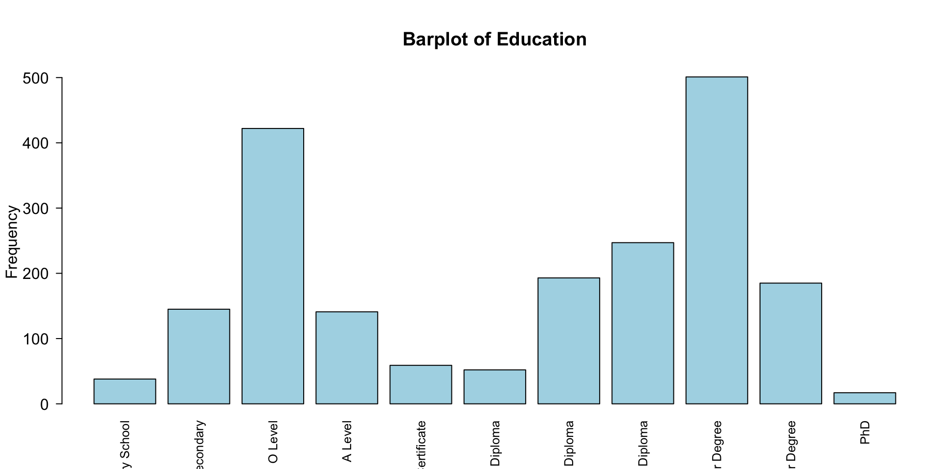
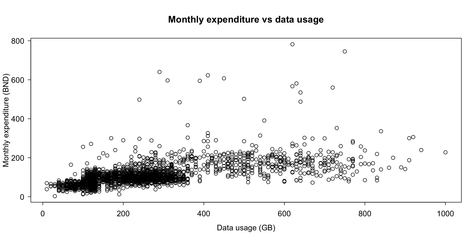
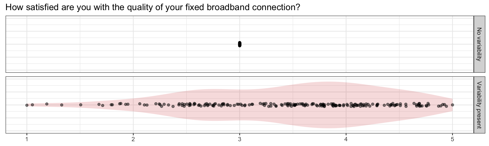
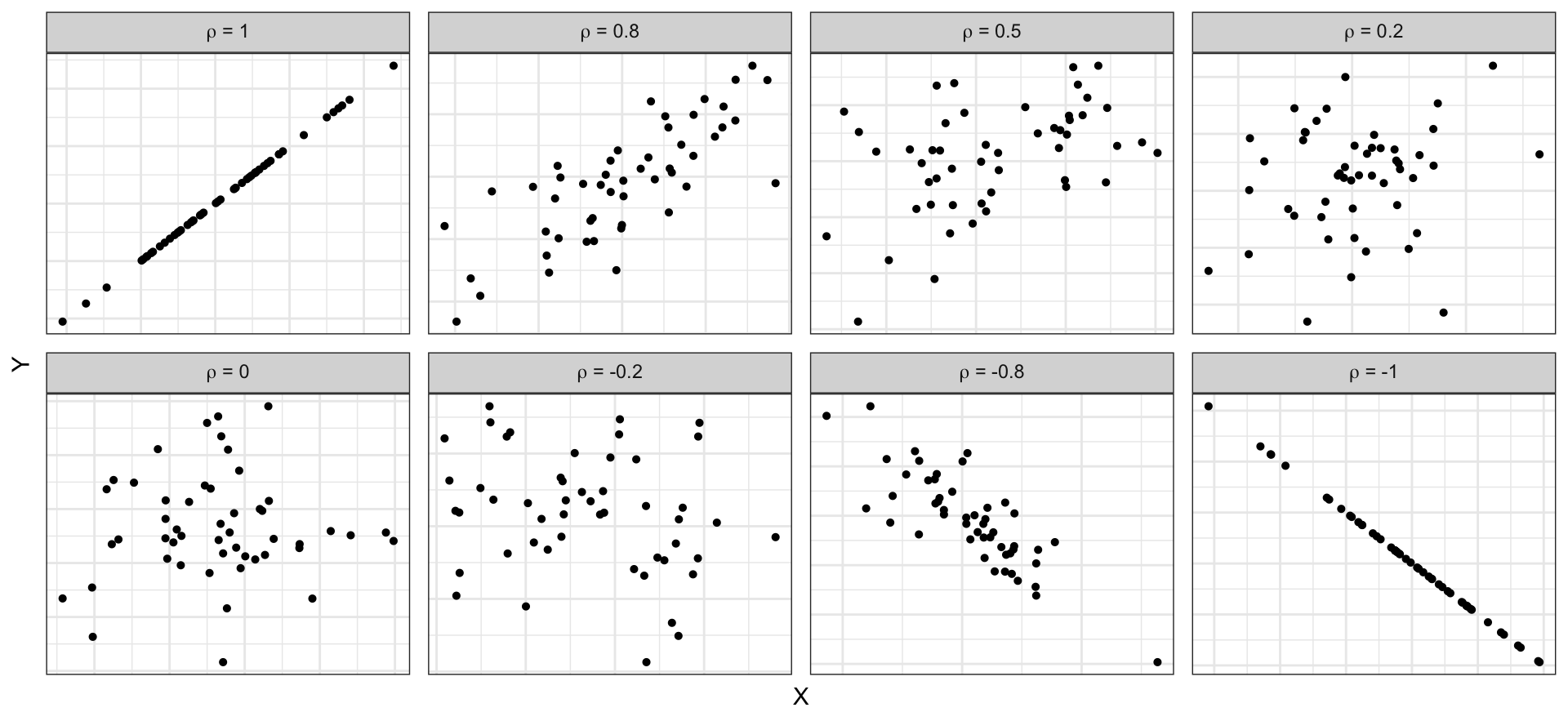
At its core, statistics is the science of understanding variability.

  • No variability = no insight.
  • Segmentation, patterns or predictors of dissatisfaction.
  • Inform policy decisions.

Summary statistics

Continuous data

x <- dat$age
head(x)
[1] 47 38 42 47 50 33
# Mean and standard deviation
mean(x)
[1] 38.537
sd(x)
[1] 11.96885
# Quick summary of the data
summary(x)
   Min. 1st Qu.  Median    Mean 3rd Qu.    Max. 
  10.00   29.00   39.00   38.54   47.00   69.00 

Boxplots

boxplot(x, horizontal = TRUE, main = "Boxplot of Age", ylab = "Age", 
        col = "lightblue")

Histograms

hist(x, main = "Histogram of Age", xlab = "Age", ylab = "Frequency", 
     col = "lightblue", breaks = 10)

Histograms and density plots

hist(x, main = "Histogram of Age with density overlaid", xlab = "Age", 
     ylab = "Density", col = "lightblue", breaks = 10, prob = TRUE)
lines(density(x), lwd = 3, col = "red3")

Summary statistics

Nominal (discrete) data

x <- dat$gender
head(x)
[1] Female Male   Female Male   Male   Female
Levels: Male Female
# No such thing as the 'mean' of character vectors!
mean(x)
[1] NA
# Instead, do this:
table(x)
x
  Male Female 
   990   1010 
prop.table(table(x))
x
  Male Female 
 0.495  0.505 
# If you're fancy:
chisq.test(table(x))

    Chi-squared test for given probabilities

data:  table(x)
X-squared = 0.2, df = 1, p-value = 0.6547

Bar plots

x <- dat$education
barplot(table(x), las = 2, cex.names = 0.8, main = "Barplot of Education", 
        ylab = "Frequency", col = "lightblue")

Co-variability

Continuous vs continuous

Continuous vs nominal

Nominal vs nominal

Scatter plots

plot(q_fbexpend ~ q_fbusage, data = dat,
     main = "Monthly expenditure vs data usage", 
     xlab = "Data usage (GB)", ylab = "Monthly expenditure (BND)")

Strength of linear relationships

cor(dat$q_fbexpend, dat$q_fbusage) 
[1] 0.5741981

\[ \rho = \frac{\text{Cov(X,Y)}}{\text{SD(X)}\times\text{SD(Y)}} \in [-1,1] \]
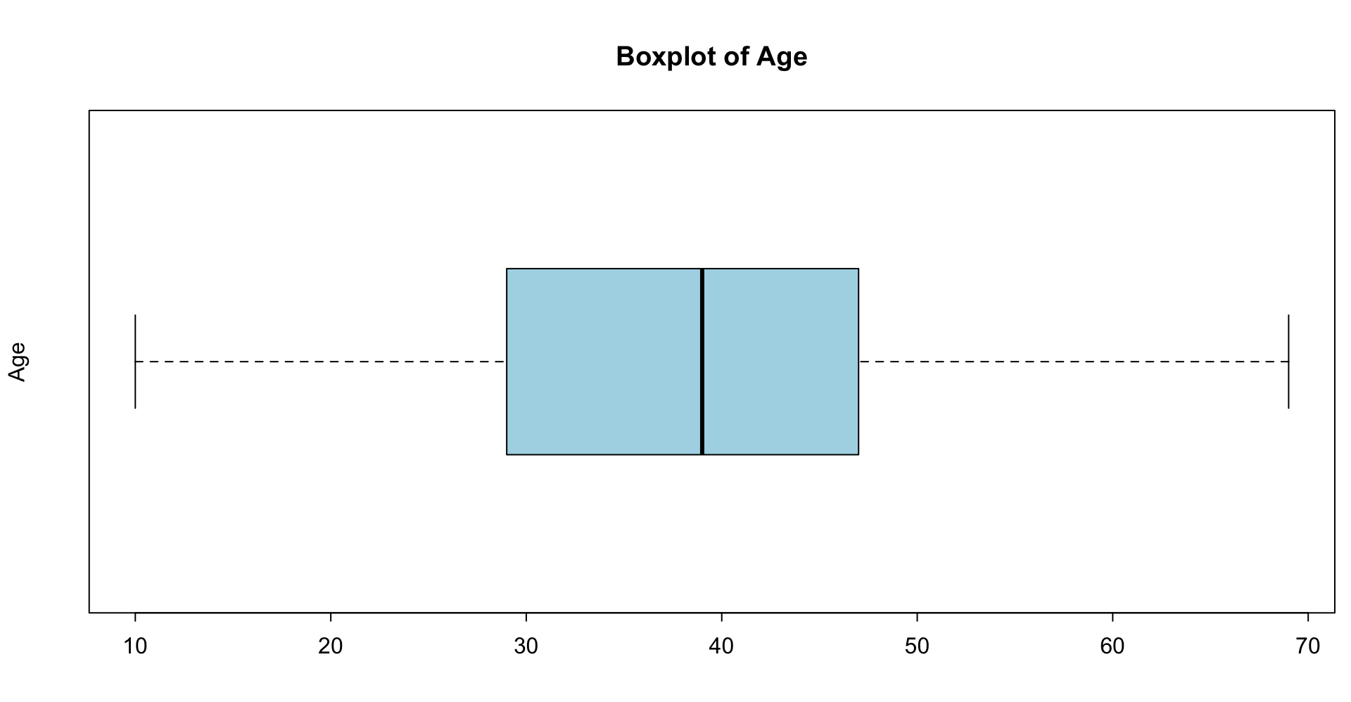
(Simple) Linear regression model

fit <- lm(q_fbexpend ~ q_fbusage, data = dat)
summary(fit)

\[ \begin{gathered} y = \beta_0 + \beta_1 x + \epsilon \\ \epsilon \sim N(0, \sigma^2) \end{gathered} \]


Call:
lm(formula = q_fbexpend ~ q_fbusage, data = dat)

Residuals:
    Min      1Q  Median      3Q     Max 
-150.05  -25.56   -6.91   15.91  593.04 

Coefficients:
             Estimate Std. Error t value Pr(>|t|)    
(Intercept) 55.601997   2.223077   25.01   <2e-16 ***
q_fbusage    0.215099   0.006861   31.35   <2e-16 ***
---
Signif. codes:  0 '***' 0.001 '**' 0.01 '*' 0.05 '.' 0.1 ' ' 1

Residual standard error: 54.07 on 1998 degrees of freedom
Multiple R-squared:  0.3297,    Adjusted R-squared:  0.3294 
F-statistic: 982.8 on 1 and 1998 DF,  p-value: < 2.2e-16

Scatter plots (with linear trend line)

# continuing previous plot
abline(fit, col = "red3", lwd = 2)

Five-number summary by group

by(dat$q_fbexpend, dat$gender, summary)
dat$gender: Male
   Min. 1st Qu.  Median    Mean 3rd Qu.    Max. 
  12.65   79.26  101.46  114.92  133.07  640.10 
------------------------------------------------------------ 
dat$gender: Female
   Min. 1st Qu.  Median    Mean 3rd Qu.    Max. 
   3.00   76.36   99.53  113.27  130.42  782.00 
boxplot(q_fbexpend ~ gender, dat, range = 5, col = "lightblue", horizontal = TRUE,
        ylab = NULL, xlab = NULL, main = "Monthly expenditure (BND)")

Contingency tables

tab1 <- table(dat$gender, dat$q_fbqual)
print(tab1)
        
         Very Poor Poor Fair Good Very Good Excellent
  Male          26   68  204  333       271        88
  Female        16   62  236  333       254       109
tab2 <- prop.table(tab1, margin = 1)  # row proportions
round(tab2, 2)
        
         Very Poor Poor Fair Good Very Good Excellent
  Male        0.03 0.07 0.21 0.34      0.27      0.09
  Female      0.02 0.06 0.23 0.33      0.25      0.11
chisq.test(tab1)

    Pearson's Chi-squared test

data:  tab1
X-squared = 7.575, df = 5, p-value = 0.1813

Side-by-side bar charts

Mosaic plots

Mosaic plots (Titanic data set)

Advanced

More co-variability

Grammar of graphics

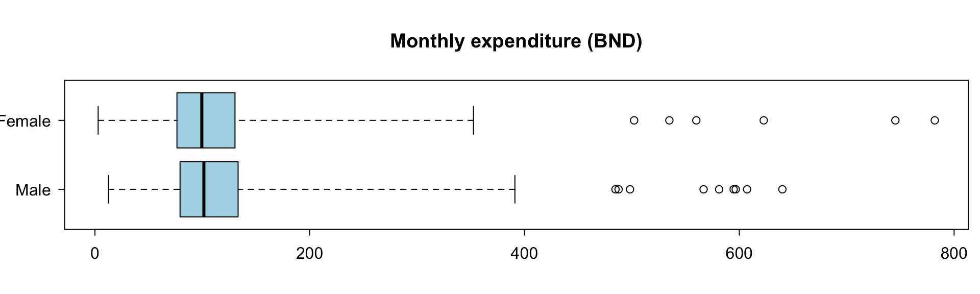
A statistical graphic is a…

  • mapping of data
  • which may be statistically transformed (summarized, log-transformed, etc.)
  • to aesthetic attributes (color, size, xy-position, etc.)
  • using geometric objects (points, lines, bars, etc.)
  • and mapped onto a specific facet and coordinate system

Breaking down the ggplot() call

dat |>
  mutate(
    # Categorise age
    age = cut(age, breaks = c(0, 18, 40, 60, Inf),
              labels = paste0("Age: ", c("< 18", "18-40", "40-60", "60+"))),
    # Collapse education levels into three groups
    education = fct_collapse(
      education,
      `Secondary\nor lower` = c("Primary School", "Lower Secondary", "O Level", "A Level"),
      `Post-\nsecondary` = c("National Certificate", "Diploma", "National Diploma", "Higher National Diploma"),
      Tertiary = c("Bachelor Degree", "Master Degree", "PhD")
    )
  ) |>
  ggplot(aes(x = q_fbusage, y = q_fbexpend, col = gender)) +
  geom_point(alpha = 0.6) +
  geom_smooth(method = "lm", se = FALSE, fullrange = TRUE, linewidth = 0.8) +
  facet_grid(education ~ age) +
  labs(x = "Data usage (GB)", y = "Monthly expenditure (BND)", col = "Gender")

Fun part: Themes!

Spatial data

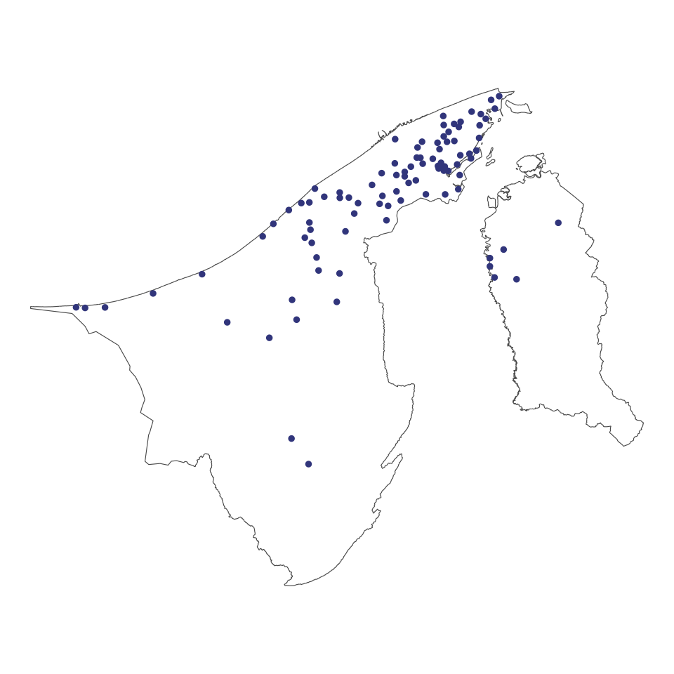
Any \((x,y)\) coordinate data, e.g. locations of

  • Masjids in Brunei
  • Schools in Brunei
  • Shops
  • etc.

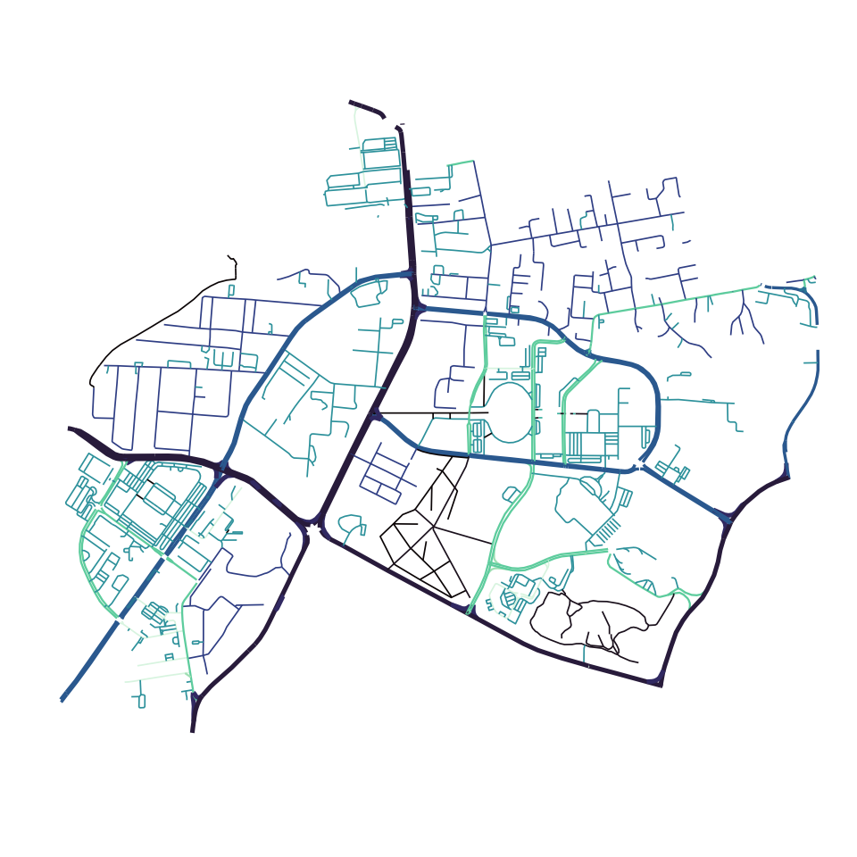
A collection of points connected by lines, e.g.

  • Roads
  • Rivers
  • Train lines
  • etc.

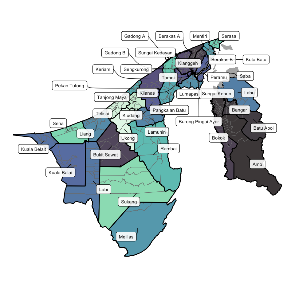
A closed two-dimensional area formed by connecting a finite number of line segments, e.g.

  • Kampongs
  • Mukims
  • Districts
  • etc.

Spatial patterns

Everything is related to everything else, but near things are more related than distant things. —Waldo Tobler, on the ‘First Law of Geography’

spend_mkm_df <-
  dat |>
  summarise(spend = mean(q_fbexpend), .by = mukim)
head(spend_mkm_df, 8)
# A tibble: 8 × 2
  mukim                spend
  <chr>                <dbl>
1 Mukim Seria           116.
2 Mukim Berakas A       115.
3 Mukim Pangkalan Batu  121.
4 Mukim Berakas B       113.
5 Mukim Kota Batu       137.
6 Mukim Tanjong Maya    106.
7 Mukim Pekan Tutong    131.
8 Mukim Gadong A        120.

Understanding spatial ICT spending or usage patterns reveals digital inequality and empowers targeted investments for a more connected, inclusive Brunei.

Spatial patterns (cont.)

Spatial analysis requires joining

  1. spatial (GIS) data, with
  2. geo-coded study data

left_join(
    mkm_sf,  # spatial
    spend_mkm_df  # study
  ) |>
  ggplot() +
  geom_sf(aes(fill = spend)) 

Quantitative text analysis

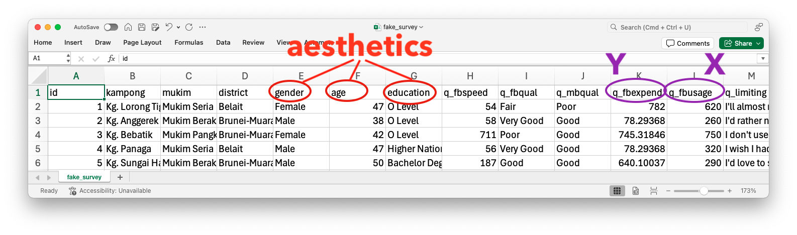
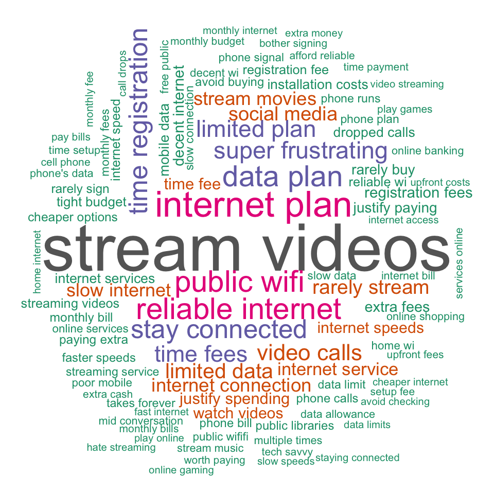
# (Comment section) Describe the top reason that limits your internet access.
head(dat$q_limiting, 5)
[1] "I'll almost never download software that costs hundreds of dollars upfront – it's just not worth breaking the bank every five minutes to keep basic services running fine."
[2] "I'd rather not get internet just to pay an extra $50 for installation that'll likely wear off within a year anyway."                                                       
[3] "I don't use Video Calls enough because poor calls keep dropping mid-conversation."                                                                                         
[4] "I wish I had reliable internet at home, but it's so easy for me to just use my neighbor's place when I need it."                                                           
[5] "I'd love to stream more videos and games if it weren't for how expensive it costs me every month right now."                                                               

Word clouds and bigrams

Reproducible reports

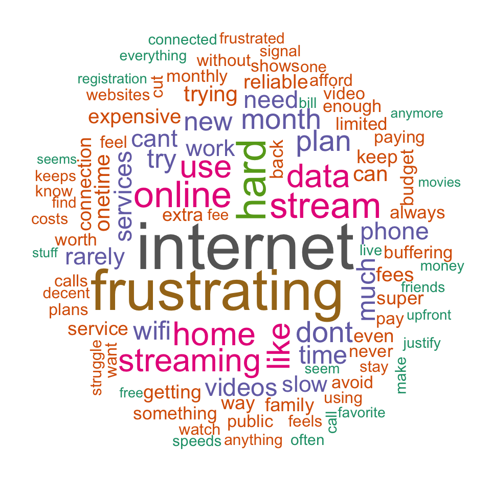
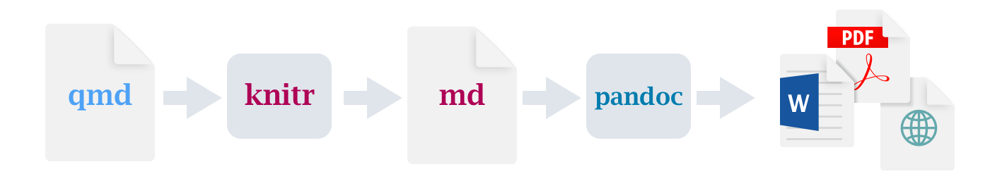
Quarto is an open-source scientific and technical publishing system. It enables you to create dynamic documents, reports, presentations, and websites using R code and Markdown language.

DEMO See report.qmd file

Ending

Where to go from here?

Thanks!

Questions?