class: center, middle, inverse, title-slide # SR-5101 Advanced Research Skills ## (1/3) Exploratory Data Analysis ### Dr. Haziq Jamil ### Semester 1, 2020/21 --- # Admin - Lecturer information ```html Dr. Haziq Jamil Assistant Professor in Statistics Room M1.09 haziq.jamil@ubd.edu.bn ``` - Three classes scheduled: - Mon 19/10 0800-1000 ONLINE - Mon 26/10 0800-1000 ONLINE - Mon 2/11 0800-1000 ONLINE - Slides and materials are available from my website. - Please download RStudio. --- .center[] ---  --- # Two kinds of data science - Type I Data Scientist - Knows a lot about Data Science techniques or technologies. - Has a deep knowledge of their topic/domain of interest. - Able to highlight details and patterns in the data. - **"Exploratory Data Analysis"** -- - Type II Data Scientist - Focus on business goals and problems. - Solves problems with data-based evidence. - Good communicators and story tellers. - **"Statistical Modelling and Inference"** -- .footnote[ ---- Categorisations are not my own. See this [blog post](https://brendantierneydatamining.blogspot.com/2013/03/type-i-and-type-ii-data-scientists.html) by B Tierney. It seems that Data Science as a subject continues to evolve to this day. ] --- layout: true # Exploratory Data Analysis --- .center[.large[You are given a data set, what do you do first?]] -- - EDA is a systematic way of manipulating, transforming, and visualising data. - It is an iterative cycle. - One objective in mind: **Generate many promising leads that you can later explore in more depth**. -- .center[.large[There are no strict rules to follow—investigate every idea!]] --- .center[.large[EDA is an important part of any data analysis, even if the questions are handed to you on a platter.]] EDA involves: - Data cleaning - Looking at patterns - Asking questions / forming hypotheses --- layout: false # Asking questions 1. What type of variation occurs within my variables? 2. What type of covariation occurs between my variables? -- - A **variable** is a quantity, quality, or property that you can measure. - A **value** is the state of a variable when you measure it. The value of a variable may change from measurement to measurement. - An **observation** (or a sample) is a set of measurements made under similar conditions. --- # Variation .center[.large[Variation is the tendency of the values of a variable to change from measurement to measurement.]] - Measurement of **continuous variables** can vary from one observation to another due to many factors (e.g. random noise, measurement error, etc.)—Even if they are supposedly constant (e.g. gravity, speed of light, molar mass constant, etc.) - **Categorical variables** (i.e. discrete variables) can also vary if you measure across different subjects (e.g. the eye colors of different people), or different times (e.g. the energy levels of an electron at different moments). -- .center[.large[No variation = no information (boring!). We are interested to see *patterns* of variation in each variable, which can reveal interesting information.]] --- # Install `tidyverse` package Before we begin, install the `tidyverse` package ```r install.packages("tidyverse") ``` Contains a bunch of useful packages to help us do data science. Check out https://www.tidyverse.org for more details. Most examples are based on this book: https://r4ds.had.co.nz --- # Fuel economy data set Fuel economy data from 1999 and 2008 for 38 popular models of car ( `\(n\)` =234, `\(p\)` = 11). ```r mpg ``` ``` ## # A tibble: 234 x 11 ## manufacturer model displ year cyl trans drv cty hwy ## <chr> <chr> <dbl> <int> <int> <chr> <chr> <int> <int> ## 1 audi a4 1.8 1999 4 auto… f 18 29 ## 2 audi a4 1.8 1999 4 manu… f 21 29 ## 3 audi a4 2 2008 4 manu… f 20 31 ## 4 audi a4 2 2008 4 auto… f 21 30 ## 5 audi a4 2.8 1999 6 auto… f 16 26 ## 6 audi a4 2.8 1999 6 manu… f 18 26 ## 7 audi a4 3.1 2008 6 auto… f 18 27 ## 8 audi a4 q… 1.8 1999 4 manu… 4 18 26 ## 9 audi a4 q… 1.8 1999 4 auto… 4 16 25 ## 10 audi a4 q… 2 2008 4 manu… 4 20 28 ## # … with 224 more rows, and 2 more variables: fl <chr>, ## # class <chr> ``` Type `?mpg` in R to learn more about this data set (or any function of R!). --- layout:true # 5-number summary --- The five-number summary is a set of descriptive statistics that provides information about a dataset. It consists of the five most important sample percentiles: 1. The sample minimum 2. The lower quartiles (Q1, 25%) 3. The median (Q2, 50%) 4. The upper quartile (Q3, 75%) 5. The sample maximum -- This is a concise way of summarising the **distribution** (i.e. spread) of the data set (without plotting). .center[.large[Beware of the flaw of averages!]] --- .center[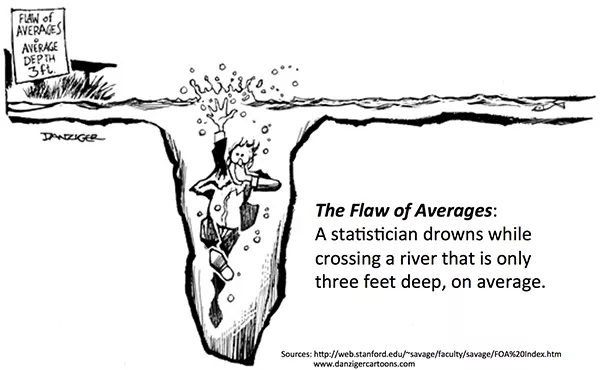] --- ```r summary(mpg) ``` ``` ## manufacturer model displ ## Length:234 Length:234 Min. :1.600 ## Class :character Class :character 1st Qu.:2.400 ## Mode :character Mode :character Median :3.300 ## Mean :3.472 ## 3rd Qu.:4.600 ## Max. :7.000 ## year cyl trans ## Min. :1999 Min. :4.000 Length:234 ## 1st Qu.:1999 1st Qu.:4.000 Class :character ## Median :2004 Median :6.000 Mode :character ## Mean :2004 Mean :5.889 ## 3rd Qu.:2008 3rd Qu.:8.000 ## Max. :2008 Max. :8.000 ## drv cty hwy ## Length:234 Min. : 9.00 Min. :12.00 ## Class :character 1st Qu.:14.00 1st Qu.:18.00 ## Mode :character Median :17.00 Median :24.00 ## Mean :16.86 Mean :23.44 ## 3rd Qu.:19.00 3rd Qu.:27.00 ## Max. :35.00 Max. :44.00 ## fl class ## Length:234 Length:234 ## Class :character Class :character ## Mode :character Mode :character ## ## ## ``` --- layout:false # Frequency tables .center[.large[Notice that R gives the 5-number summary for **continuous variables** only]] - Obviously, it is not possible to calculate the summary statistics of categorical variables. - For categorical variables: one way of summarising it is using frequency tables. ```r table(mpg$drv) ``` ``` ## ## 4 f r ## 103 106 25 ``` - Later we'll see covariation between two categorical variables and how to tabulate this. --- layout: false # Visualisation How you visualise the distribution of a variable will depend on whether the variable is categorical or continuous. ### Continuous - Box & Whisker plot - Histogram - Smoothed density plot ### Categorical - Bar plots --- # Histogram ```r summary(mpg$hwy) ``` ``` ## Min. 1st Qu. Median Mean 3rd Qu. Max. ## 12.00 18.00 24.00 23.44 27.00 44.00 ``` ```r ggplot(data = mpg) + geom_histogram(mapping = aes(x = hwy)) ``` <img src="lecture1_files/figure-html/histplot-1.png" width="800px" /> --- # Histogram ```r summary(mpg$hwy) ``` ``` ## Min. 1st Qu. Median Mean 3rd Qu. Max. ## 12.00 18.00 24.00 23.44 27.00 44.00 ``` ```r ggplot(data = mpg) + geom_histogram(mapping = aes(x = hwy), binwidth = 5) ``` <img src="lecture1_files/figure-html/histplot2-1.png" width="800px" /> --- # Histogram ```r summary(mpg$hwy) ``` ``` ## Min. 1st Qu. Median Mean 3rd Qu. Max. ## 12.00 18.00 24.00 23.44 27.00 44.00 ``` ```r ggplot(data = mpg) + geom_histogram(mapping = aes(x = hwy), binwidth = 0.5) ``` <img src="lecture1_files/figure-html/histplot3-1.png" width="800px" /> --- # Smoothed density plot ```r summary(mpg$hwy) ``` ``` ## Min. 1st Qu. Median Mean 3rd Qu. Max. ## 12.00 18.00 24.00 23.44 27.00 44.00 ``` ```r ggplot(data = mpg) + geom_density(mapping = aes(x = hwy)) ``` <img src="lecture1_files/figure-html/densplot-1.png" width="800px" /> --- # Histogram with smoothed density plot ```r ggplot(data = mpg) + geom_histogram(mapping = aes(x = hwy, y = stat(density)), binwidth = 5) + geom_density(mapping = aes(x = hwy), col = "red", size = 1) ``` <img src="lecture1_files/figure-html/histdensplot-1.png" width="800px" /> --- layout: true # Box & Whisker plot --- ```r summary(mpg$hwy) ``` ``` ## Min. 1st Qu. Median Mean 3rd Qu. Max. ## 12.00 18.00 24.00 23.44 27.00 44.00 ``` ```r ggplot(data = mpg) + geom_boxplot(mapping = aes(y = hwy)) ``` <img src="lecture1_files/figure-html/bwplot-1.png" width="800px" /> --- .center[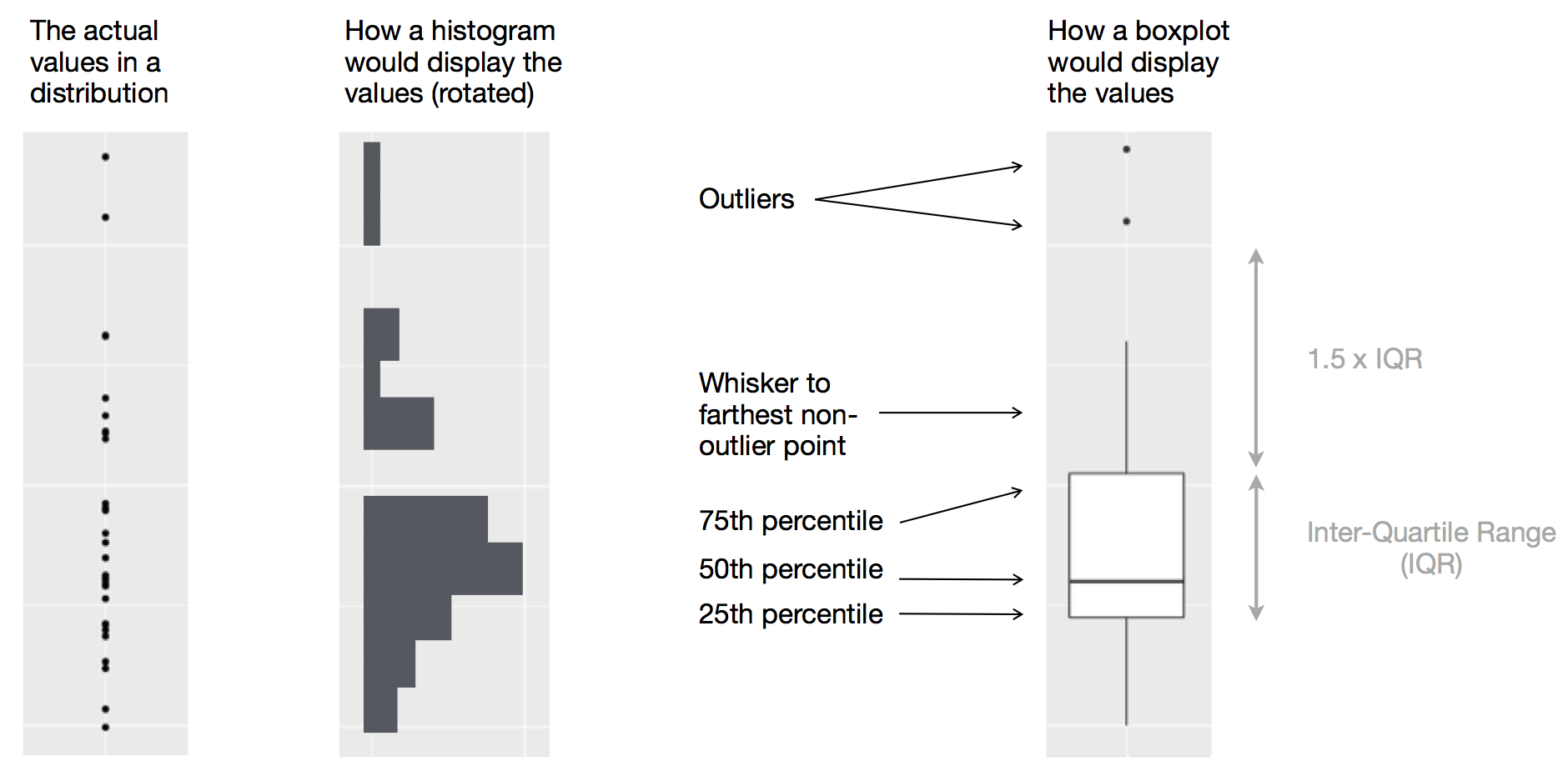] --- ```r ggplot(data = mpg, mapping = aes(y = hwy, x = 0)) + geom_boxplot() + geom_point() ``` <img src="lecture1_files/figure-html/bwplot2-1.png" width="800px" /> --- ```r ggplot(data = mpg, mapping = aes(y = hwy, x = 0)) + geom_boxplot() + geom_jitter(width = 0.3) ``` <img src="lecture1_files/figure-html/bwplot3-1.png" width="800px" /> --- layout: false # Bar plot .center[.large[Use for **discrete variables** only! This is not the same as a histogram!]] ```r ggplot(data = mpg) + geom_bar(mapping = aes(x = class)) ``` <img src="lecture1_files/figure-html/barplot-1.png" width="800px" /> --- layout: true # Covariation --- If variation describes the behavior within a variable, covariation describes the behavior between variables. Covariation is the tendency for the values of two or more variables to vary together in a related way. --- ### Continuous vs continuous variables - Scatter plot - Smoothed lines ### Continuous vs categorical variables - Box & whisker - Faceting - Additional aesthetic mappings ### Categorical vs categorical variables - Count plots - Heat maps --- layout: false # Scatter plot ```r ggplot(data = mpg) + geom_point(mapping = aes(x = displ, y = hwy)) ``` <img src="lecture1_files/figure-html/scatter-1.png" width="800px" /> --- layout: true # Smoothed line --- ```r ggplot(data = mpg, mapping = aes(x = displ, y = hwy)) + geom_point() + geom_smooth() ``` <img src="lecture1_files/figure-html/smoothline-1.png" width="800px" /> --- ```r ggplot(data = mpg, mapping = aes(x = displ, y = hwy)) + geom_point() + geom_smooth(se = FALSE) ``` <img src="lecture1_files/figure-html/smoothline2-1.png" width="800px" /> --- ```r ggplot(data = mpg, mapping = aes(x = displ, y = hwy)) + geom_point() + geom_smooth(se = FALSE, method = "lm") ``` <img src="lecture1_files/figure-html/smoothline3-1.png" width="800px" /> --- layout: false # Box & Whisker ```r ggplot(data = mpg) + geom_boxplot(mapping = aes(y = hwy, x = class)) + labs(y = "Highway miles per gallon", x = "Vehicle type") ``` <img src="lecture1_files/figure-html/bwplot4-1.png" width="800px" /> --- # Faceting ```r ggplot(data = mpg, mapping = aes(x = displ, y = hwy)) + geom_point() + geom_smooth(se = FALSE, method = "lm") + facet_wrap(~ class, nrow = 2) ``` <img src="lecture1_files/figure-html/smoothlinefacet-1.png" width="800px" /> --- layout: true # Additional aesthetics --- ```r ggplot(data = mpg, mapping = aes(x = displ, y = hwy, col = class)) + geom_point() ``` <img src="lecture1_files/figure-html/addaes-1.png" width="800px" /> --- ```r ggplot(data = mpg, mapping = aes(x = displ, y = hwy, col = class)) + geom_point() + geom_smooth(se = FALSE, method = "lm") ``` <img src="lecture1_files/figure-html/addaes2-1.png" width="800px" /> --- layout: false # Contingency tables Recall the frequency table earlier? We can also do it for two categorical variables. ```r table(mpg$class, mpg$cyl) ``` ``` ## ## 4 5 6 8 ## 2seater 0 0 0 5 ## compact 32 2 13 0 ## midsize 16 0 23 2 ## minivan 1 0 10 0 ## pickup 3 0 10 20 ## subcompact 21 2 7 5 ## suv 8 0 16 38 ``` --- # Count plot ```r ggplot(data = mpg) + geom_count(mapping = aes(x = class, y = cyl)) ``` <img src="lecture1_files/figure-html/countplot-1.png" width="800px" /> --- # Heatmap ```r dat <- reshape2::melt(table(mpg$class, mpg$cyl), var = c("class", "cyl")) ggplot(data = dat) + geom_tile(mapping = aes(x = class, y = cyl, fill = value)) + scale_fill_gradient(low = "white", high = "blue") ``` <img src="lecture1_files/figure-html/heatmap-1.png" width="800px" /> --- class: inverse, middle, center # Example 1: Titanic survival data --- layout: true # Load the data --- ```r library(readr) titanic <- read_csv("titanic.csv") ``` ``` ## Parsed with column specification: ## cols( ## PassengerId = col_double(), ## Survived = col_double(), ## Pclass = col_double(), ## Name = col_character(), ## Sex = col_character(), ## Age = col_double(), ## SibSp = col_double(), ## Parch = col_double(), ## Ticket = col_character(), ## Fare = col_double(), ## Cabin = col_character(), ## Embarked = col_character() ## ) ``` --- .center[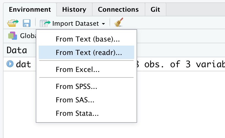] --- layout: true # Look at the dataset --- ```r titanic # or type View(titanic) ``` ``` ## # A tibble: 891 x 12 ## PassengerId Survived Pclass Name Sex Age SibSp Parch ## <dbl> <dbl> <dbl> <chr> <chr> <dbl> <dbl> <dbl> ## 1 1 0 3 Brau… male 22 1 0 ## 2 2 1 1 Cumi… fema… 38 1 0 ## 3 3 1 3 Heik… fema… 26 0 0 ## 4 4 1 1 Futr… fema… 35 1 0 ## 5 5 0 3 Alle… male 35 0 0 ## 6 6 0 3 Mora… male NA 0 0 ## 7 7 0 1 McCa… male 54 0 0 ## 8 8 0 3 Pals… male 2 3 1 ## 9 9 1 3 John… fema… 27 0 2 ## 10 10 1 2 Nass… fema… 14 1 0 ## # … with 881 more rows, and 4 more variables: Ticket <chr>, ## # Fare <dbl>, Cabin <chr>, Embarked <chr> ``` Or just double-click the object 'titanic' from the environment window. --- Can also subset some variables: ```r titanic[, c("Ticket", "Fare", "Cabin", "Embarked")] ``` ``` ## # A tibble: 891 x 4 ## Ticket Fare Cabin Embarked ## <chr> <dbl> <chr> <chr> ## 1 A/5 21171 7.25 <NA> S ## 2 PC 17599 71.3 C85 C ## 3 STON/O2. 3101282 7.92 <NA> S ## 4 113803 53.1 C123 S ## 5 373450 8.05 <NA> S ## 6 330877 8.46 <NA> Q ## 7 17463 51.9 E46 S ## 8 349909 21.1 <NA> S ## 9 347742 11.1 <NA> S ## 10 237736 30.1 <NA> C ## # … with 881 more rows ``` --- layout: true # What are we thinking? --- As a data scientist, you should be curious about how the data set looks like. - How many columns (variables) were measured? - How many rows (instances or samples) are available? - What kind of variables are there? - Are there any missing values? - Do I need to clean it? - Do I understand what the variables mean? (is there a codebook/data dictionary?) -- A great data scientist will also mould his state of mind to immerse themselves fully in the data. - What day/month/year did the Titanic sail for its last journey? - What were the ports of call? - What was the public mood surrounding the Titanic? --- .pull-left[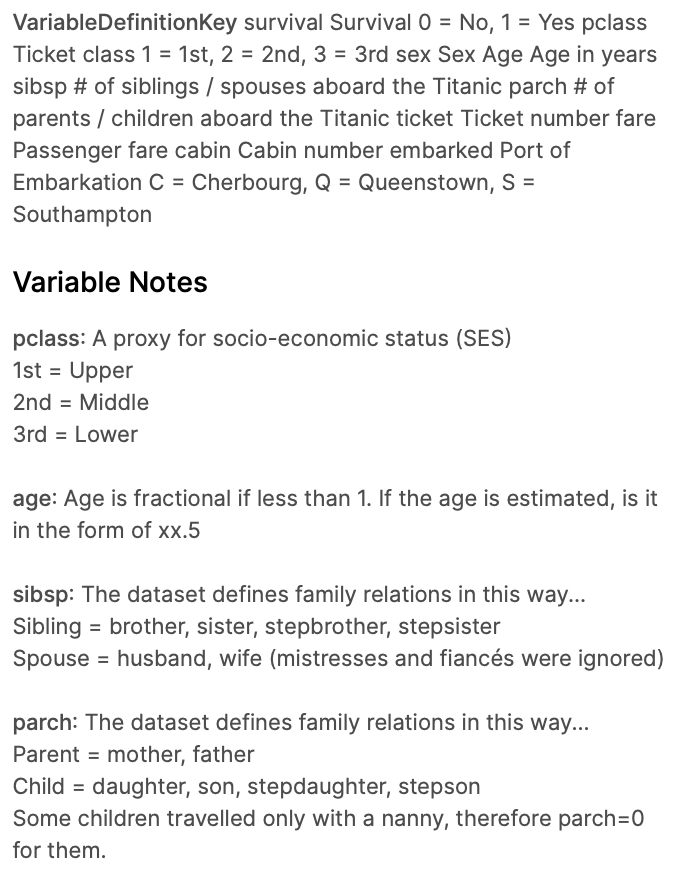] .pull-right[ Data obtained from https://www.kaggle.com/c/titanic Check where you obtained your data for the data dictionary. ] --- Often, we can get an immediate idea of what to do by just looking at the shape of the data and what's available. ```r unlist(lapply(titanic, class)) ``` ``` ## PassengerId Survived Pclass Name Sex ## "numeric" "numeric" "numeric" "character" "character" ## Age SibSp Parch Ticket Fare ## "numeric" "numeric" "numeric" "character" "numeric" ## Cabin Embarked ## "character" "character" ``` Let's try ask some questions of the data. -- - How many passengers survived? - What is the distribution of passenger class? - What's the average age of passengers? - Any difference in survival rates among other variables? --- layout: true ## How many passengers survived? --- ```r table(titanic$Survived) ``` ``` ## ## 0 1 ## 549 342 ``` ```r # Convert to factor (i.e. categorical variables) titanic$Survived <- factor(titanic$Survived) levels(titanic$Survived) <- c("No", "Yes") table(titanic$Survived) ``` ``` ## ## No Yes ## 549 342 ``` --- ```r ggplot(titanic, aes(x = Survived)) + geom_bar() ``` <img src="lecture1_files/figure-html/unnamed-chunk-12-1.png" width="800px" /> --- ```r ggplot(titanic, aes(x = Survived, fill = Survived)) + geom_bar() ``` <img src="lecture1_files/figure-html/unnamed-chunk-13-1.png" width="800px" /> --- ```r ggplot(titanic, aes(x = Survived, fill = Survived)) + geom_bar() + geom_text(aes(label = ..count..), stat = "count", vjust = -0.5) + scale_y_continuous(limits = c(0, 600)) + theme_bw() + theme(legend.position = "none") ``` <img src="lecture1_files/figure-html/unnamed-chunk-14-1.png" width="800px" /> --- layout: false ## What is the proportion that survived? ```r ggplot(titanic, aes(x = Survived, fill = Survived, y = ..count.. / sum(..count..))) + geom_bar() + geom_text(aes(label = scales::percent(..count.. / sum(..count..))), stat = "count", vjust = -0.5) + scale_y_continuous(labels = scales::percent, name = "Proportion", limits = c(0, 0.7)) + theme_bw() + theme(legend.position = "none") ``` <img src="lecture1_files/figure-html/unnamed-chunk-15-1.png" width="800px" /> --- layout: true ## Distribution of passenger class --- ```r table(titanic$Pclass) ``` ``` ## ## 1 2 3 ## 216 184 491 ``` ```r # Convert to factor (i.e. categorical variables) titanic$Pclass <- factor(titanic$Pclass) levels(titanic$Pclass) <- c("First", "Second", "Third") table(titanic$Pclass) ``` ``` ## ## First Second Third ## 216 184 491 ``` ```r # Proportions table(titanic$Pclass) / length(titanic$Pclass) ``` ``` ## ## First Second Third ## 0.2424242 0.2065095 0.5510662 ``` --- ```r ggplot(titanic, aes(x = Pclass, fill = Pclass)) + geom_bar() + labs(x = "Passenger class", y = "Count") + theme_bw() + theme(legend.position = "none") ``` <img src="lecture1_files/figure-html/unnamed-chunk-17-1.png" width="800px" /> --- ```r ggplot(titanic, aes(x = Pclass, y = 0)) + geom_count() + labs(x = "Passenger class") + theme_bw() + theme(legend.position = "none", axis.text.y = element_blank(), axis.title.y = element_blank()) ``` <img src="lecture1_files/figure-html/unnamed-chunk-18-1.png" width="800px" /> Not a good plot! --- layout: true ## Passenger class vs survival --- ```r table(titanic$Survived, titanic$Pclass) ``` ``` ## ## First Second Third ## No 80 97 372 ## Yes 136 87 119 ``` ```r df <- reshape2::melt(table(titanic$Survived, titanic$Pclass), var = c("Survived", "Pclass")) df$prop <- df$value / nrow(titanic) # Calculate proportions df ``` ``` ## Survived Pclass value prop ## 1 No First 80 0.08978676 ## 2 Yes First 136 0.15263749 ## 3 No Second 97 0.10886644 ## 4 Yes Second 87 0.09764310 ## 5 No Third 372 0.41750842 ## 6 Yes Third 119 0.13355780 ``` --- ```r ggplot(df, aes(x = Pclass, y = value, fill = Survived)) + geom_bar(stat = "identity", position = "dodge") ``` <img src="lecture1_files/figure-html/unnamed-chunk-20-1.png" width="800px" /> --- ```r ggplot(df, aes(x = Pclass, y = prop, fill = Survived)) + geom_bar(stat = "identity", position = "fill") + geom_text(aes(label = scales::percent(prop)), position = position_fill(vjust = 0.5)) + scale_y_continuous(labels = scales::percent) + labs(x = "Passenger class", y = "Proportion") + theme_bw() ``` <img src="lecture1_files/figure-html/unnamed-chunk-21-1.png" width="800px" /> --- layout: true ## Distribution of age of passengers --- ```r ggplot(titanic, aes(x = Age, y = stat(density))) + geom_histogram() + geom_line(stat = "density", col = "blue", size = 1) ``` <img src="lecture1_files/figure-html/unnamed-chunk-22-1.png" width="800px" /> --- ```r ggplot(titanic, aes(x = Age, y = stat(density), group = Survived, fill = Survived)) + geom_histogram() ``` <img src="lecture1_files/figure-html/unnamed-chunk-23-1.png" width="800px" /> --- ```r ggplot(titanic, aes(x = Age, y = stat(density), group = Survived, col = Survived, fill = Survived)) + geom_line(stat = "density", size = 1) ``` <img src="lecture1_files/figure-html/unnamed-chunk-24-1.png" width="800px" /> --- ```r ggplot(titanic, aes(x = Age, y = stat(density), group = Survived, fill = Survived)) + geom_histogram() + geom_line(stat = "density", size = 1) + facet_grid(Survived ~ .) + theme(legend.position = "none") ``` <img src="lecture1_files/figure-html/unnamed-chunk-25-1.png" width="800px" /> --- layout: false # Wrap up - EDA is "the first thing you do when data falls onto your lap" - You should get a feel for the data, poke around, and ask questions. - Visual tools aid in formulating relevant hypotheses surrounding the data. -- Other examples of EDA: - [Predict future numbers of restaurant visitors](https://www.kaggle.com/headsortails/be-my-guest-recruit-restaurant-eda) - [Coronavirus: China and the rest of the world](https://www.kaggle.com/michau96/coronavirus-china-and-rest-of-world) - [Zillow's home value prediction](https://www.kaggle.com/philippsp/exploratory-analysis-zillow) -- NEXT TIME: How do we know the differences are significant? We will look at hypothesis testing. --- class: inverse, middle, center # END